A world-record analytics screen, designed in a day.
End-to-end design of THG's AI Catwalk Insights screen, data viz, KPI dashboards and product performance, turned around in a single day for a live world-record event.
Client
THG · AI Catwalk
Year
2026
Discipline
Mobile · Data viz
Role
Mobile design · Data visualisation · Design system
0h
Design turnaround
0
Visualisations designed
0
Insight categories
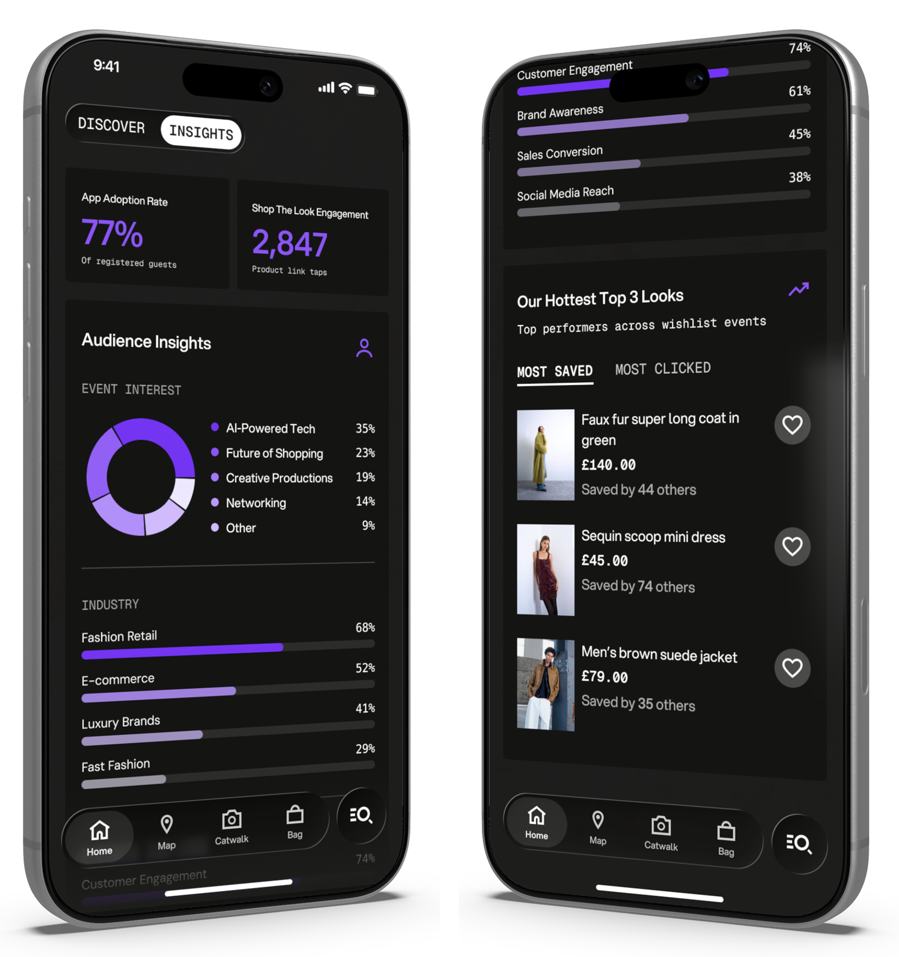
Overview
THG was hosting a world-record attempt with their AI Catwalk app. The Insights screen was the analytics surface stakeholders and event teams would use to track audience adoption, demographics, engagement and product performance. I joined the project mid-flight with no prior context and 24 hours to deliver production-ready designs, and shipped the complete screen within the day.
Challenge
01
The brief
Four thematic categories of data on a single mobile screen, with hero metrics scannable at a glance and supporting detail accessible without scroll fatigue.
02
The constraints
- 24-hour turnaround to production-ready designs
- No prior context on the app feature or its design system
- High-visibility project with significant stakeholder scrutiny
- Mobile-first, limited screen real estate for dense data
- Existing design system to align with, no time for new patterns
03
The design problem
Six visualisation types and four thematic categories on one mobile screen, without overwhelming the user. Data density versus mobile clarity, resolved within an existing system.
What I did
- 01/ 05
Aligned with the App Product Owner on requirements, audience and existing app conventions in a single working session, fast, focused, locked in scope before any design work began.
- 02/ 05
Designed the metrics layer with large numerical KPI cards for the two headline metrics (App Adoption Rate and Engagement) at the top of the screen. Hero numbers visible at first glance.
- 03/ 05
Designed audience insights using a donut chart for categorical splits and horizontal bar charts for comparative breakdowns, chart types that work at mobile width without sacrificing legibility.
- 04/ 05
Designed product performance as a tabbed view (Most Saved / Most Clicked) with product cards showing image, title, price and social proof.
- 05/ 05
Built the entire screen within the existing app design system. No new components, no new conventions, the screen feels like it has always belonged there.
Outcome
Designs delivered on time
The complete Insights screen was delivered within the 24-hour window, production-ready and aligned with the existing system. The world-record event went ahead on schedule.
A flexible visualisation framework
Not a static design but a framework, donut charts for categorical splits, horizontal bars for comparative metrics, large numericals for hero KPIs, product cards for trending content. Reusable for future iterations without new design effort.
Cross-team pickup
Stepping onto an unfamiliar project with no prior context required fast stakeholder alignment, quick pattern recognition and confident calls on data viz best practices.
Services delivered
More of my work