Product UX · E-commerce
Product listing filters
Redesigning filters, pagination and the price filter on MyProtein's listing pages, from live-site audit to released improvements.
- Role
- UX Designer
- Year
- 2026
- Platform
- Web, mobile and desktop
- Tools
- Figma, Figma Make
My work at MyProtein is internal, so I'm not cleared to share figures or results. This case study focuses on the problem, my process, and the decisions I made and why.
The problem
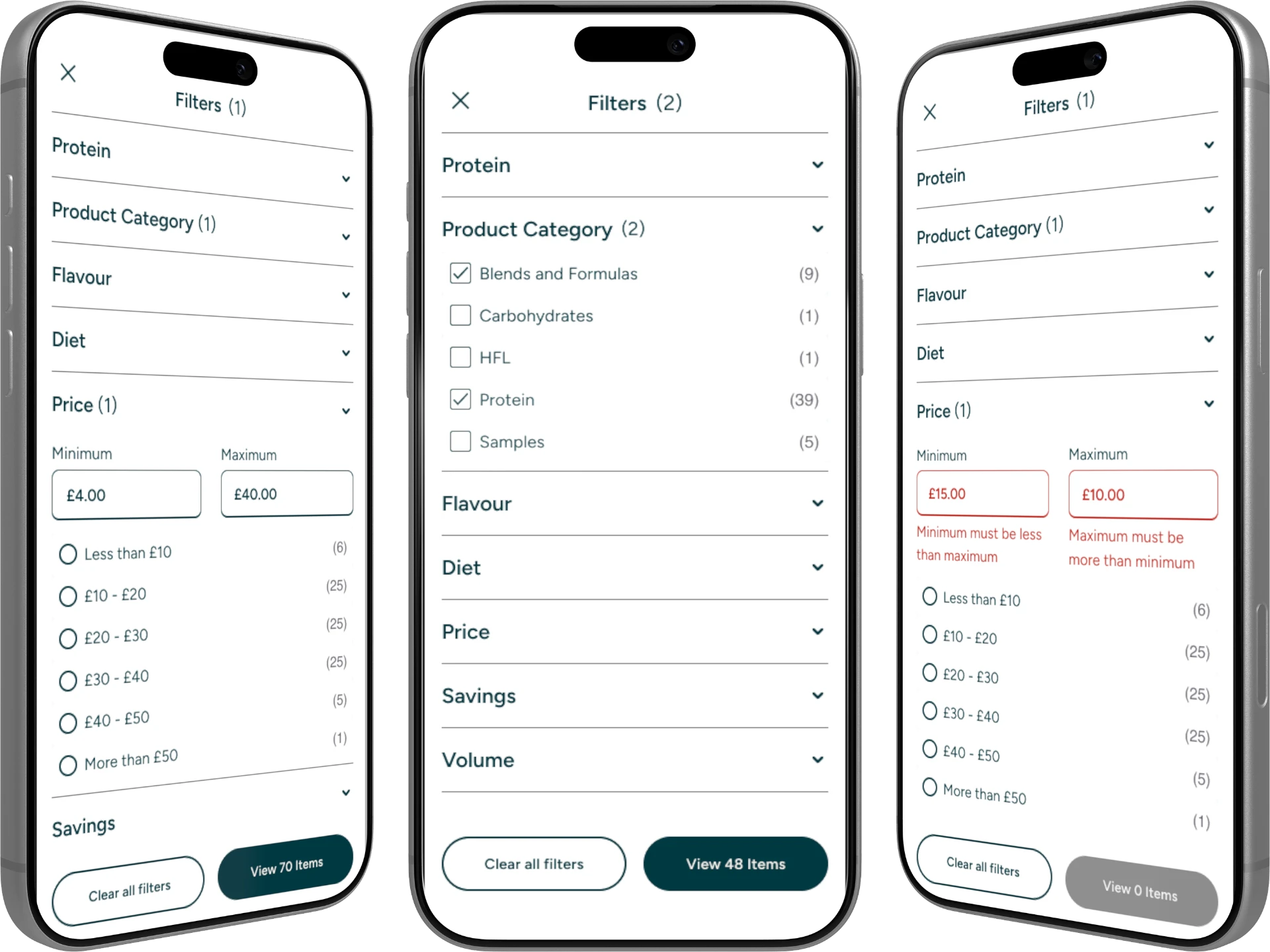
A self-initiated audit of the nutrition and clothing listing pages, on mobile and desktop, found a price filter that returned results outside the chosen range, filter labels truncated until they were illegible, and weak numbered pagination. Each one made it harder to narrow a large range and reach the right product.
My role
I owned the filter journey, pagination and price filter: the audit, the competitor benchmark, the designs and the build tickets. Product card content sat with another designer. Before designing anything I wrote a project brief covering what we were doing, why, and how we'd know it was working.
Process
- Sequenced the work as audit, competitor benchmark, synthesis, then design, so no solution came before the evidence.
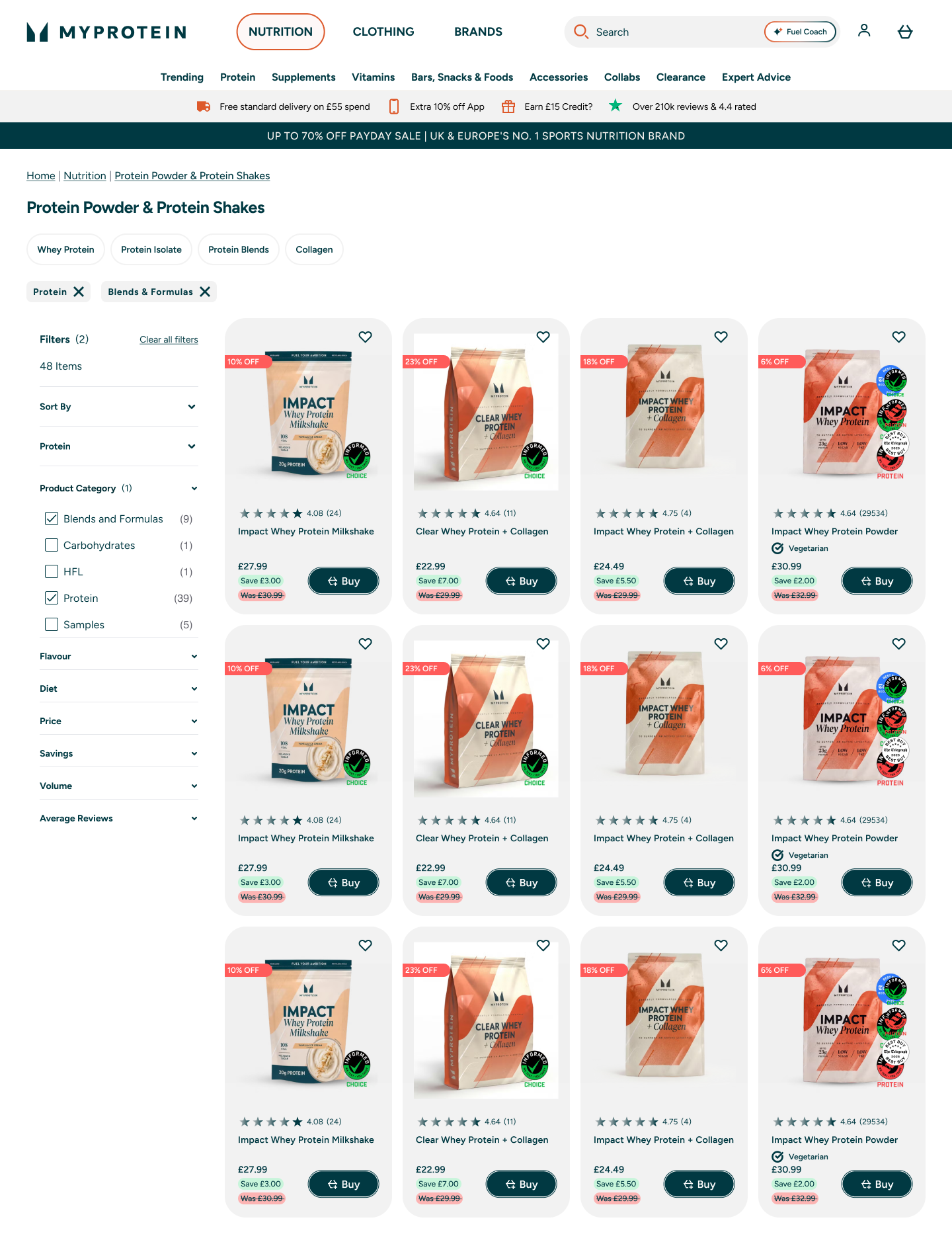
- Benchmarked against leading apparel and fitness DTC brands, including a left-hand sticky filter sidebar pattern on desktop.
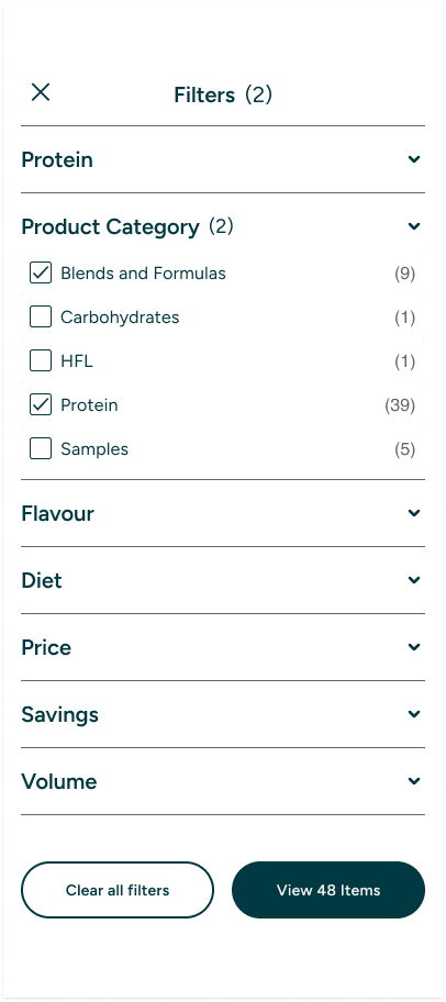
- Designed the mobile and desktop filter journeys in Figma, using Figma Make to explore variants quickly.
- Wrote three build tickets (mobile filters, desktop filters, pagination), which passed developer review with only minor comments.
Key decisions
- Replaced numbered pages with Load More and View All, with defined loading and disabled states and a screen reader announcement when results are added.
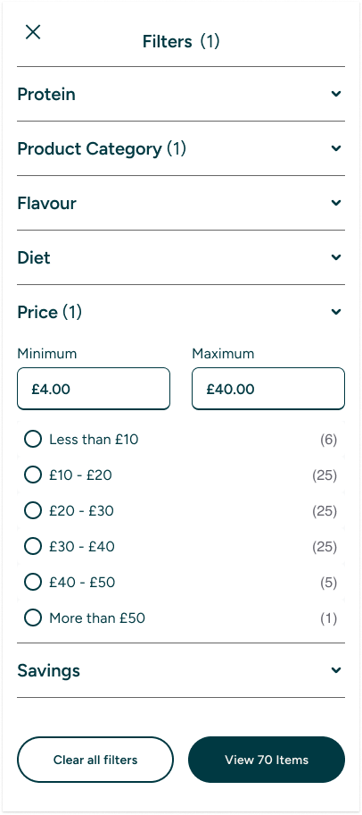
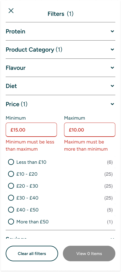
- Redesigned the price filter as preset options plus manual minimum and maximum entry, sharing one range state so a preset and a typed value can never disagree. Validation runs on blur rather than on every keystroke, and numeric-only input blocks invalid characters.
- Treated nutrition and clothing as different problems. Clothing needed filters like size and colour, nutrition needed flavour and format, which pointed to a shared structure with category-specific modules rather than one universal design.
- Wrote open questions into the tickets instead of guessing, including the SEO impact of Load More and the performance of loading a full results set.
Outcome I can share
The clothing filter designs were developed, QA'd and put into experimentation. They then went into a wider listing page experiment and were released as live improvements. I'm not able to share the results.
What I took from it
It's great to audit your live site frequently, dropping the ego and reviewing what is working and what isn't. Being honest with yourself and your designs, and constantly looking to improve and iterate.