Product UX · E-commerce
Delivery membership
The checkout component for an optional delivery membership, where the key calls were about what not to ship.
- Role
- UX Designer
- Year
- 2026
- Platform
- Web checkout and basket
- Tools
- Figma, Claude Code, interactive prototype
My work at MyProtein is internal, so I'm not cleared to share figures or results. This case study focuses on the problem, my process, and the decisions I made and why.
The problem
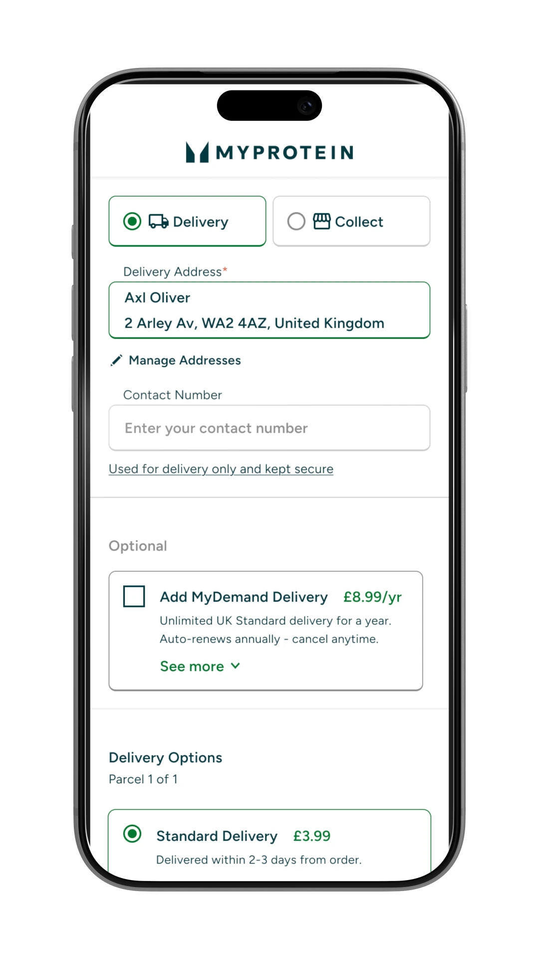
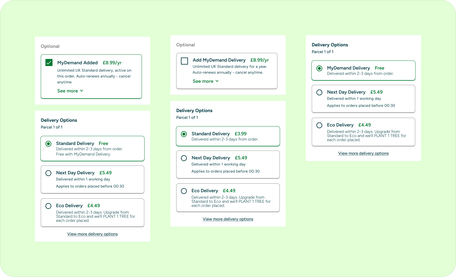
The membership had to be offered in the delivery step of checkout, alongside real delivery options. The live checkout presents it as an Add to basket card above the delivery options, in the same step where shoppers choose how their order arrives. When I explored ways to bring it closer to those options, an early pattern borrowed their radio button look, which risked shoppers selecting a paid subscription believing it was a delivery method. A colleague raised the ethical concern, and it was right.
Before: current live checkout
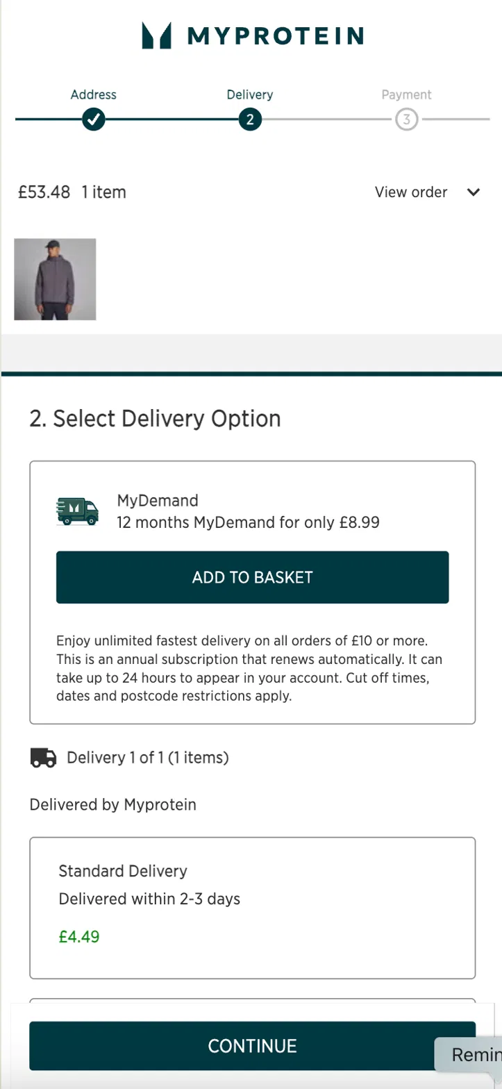
Final design
My role
I designed the component end to end, from the interaction pattern and copy through to checking it against the live terms. It began inside a UK checkout prototype I built myself and was then split out as its own piece of work.
Process
- Worked through toggle, checkbox and selectable-card patterns at length, testing each against the same question: could a shopper mistake this for a delivery choice?
- Reviewed the live build and caught a bug where the email confirmation card was styled like a physical delivery item.
- Noticed that other delivery options silently changed price when the membership was added, and designed an explicit explanation in place of a silent state change.
- Tested a value-proof section showing shoppers their likely savings.
Key decisions
- Landed on a standalone membership card with a checkbox, clearly separated from the delivery options. When a suggested alternative would have brought the same risk back, I pushed back and explained why.
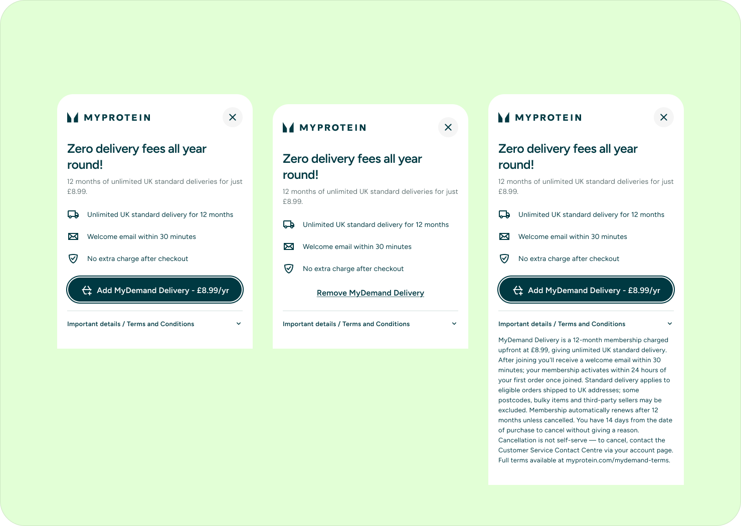
- Removed the savings section entirely. The data available only reflected people who already had the membership, so showing their savings to everyone would have overstated the value for a typical shopper. I tested a breakeven framing instead, but the maths didn't hold up honestly for a typical low-frequency customer. I replaced it with plain, feature-led copy.
- Checked every line of copy against the live terms and corrected the product name, delivery tier, cancellation terms and activation timing where the draft had drifted from them.
Design states
Outcome I can share
The component shipped in full. The final design is a single membership card with a clear headline, a short benefit list, a call to action naming the product, and collapsible terms.
What I took from it
Always put yourself in the user's shoes and ask yourself, is what I'm doing really right? Ethics, empathy and understanding are always key. This will always help you make the right decisions.