Product UX · E-commerce
Ambassador landing page
A reusable page for brand ambassadors, restructured around what usability testing showed. Now live.
- Role
- UX Designer
- Year
- 2026
- Platform
- Web, mobile first
- Tools
- Figma, Figma Make, PlaybookUX
My work at MyProtein is internal, so I'm not cleared to share figures or results. This case study focuses on the problem, my process, and the decisions I made and why.
The problem
MyProtein wanted a page for each ambassador that could turn their audience into customers, plus an overview of the whole roster. The risk was building it around assumptions about how much personal story and trust-building to lead with, and how much to lead with products.
My role
I owned the design from competitive analysis through to testing and iteration, mobile-first in Figma and then extended to desktop. I brought input from three groups (influencer strategy, UX research and design review) into one design direction.
Process
- Ran a competitive analysis, then designed mobile-first and extended the design to desktop.
- Explored an achievements widget with Figma Make and AI tools. When the output wasn't strong enough, I designed four directions by hand.
- Designed and ran a 10-participant usability study, then combined my own transcript synthesis with an independent video-based analysis from our UX researcher into one set of findings.
Key decisions
- Restructured the page around the main finding: content order, not trust or conversion elements, was the real barrier. Shoppers wanted to reach products and recommendations sooner, so I moved the ambassador's code and the Shop My Stack button higher and reordered the sections.
- Caught a scope misstep before it reached build. A request for "Instagram journey continuity" had been framed as a banner in the UI, and I reframed it as a routing and tracking decision.
- Added a "Become an Affiliate" call to action that wasn't in the brief, so visitors who wanted to join had somewhere to go. Stakeholders later agreed it was the right call.
- Found and fixed an accessibility issue: text contrast against a frosted-glass overlay.
Version 1: initial layout
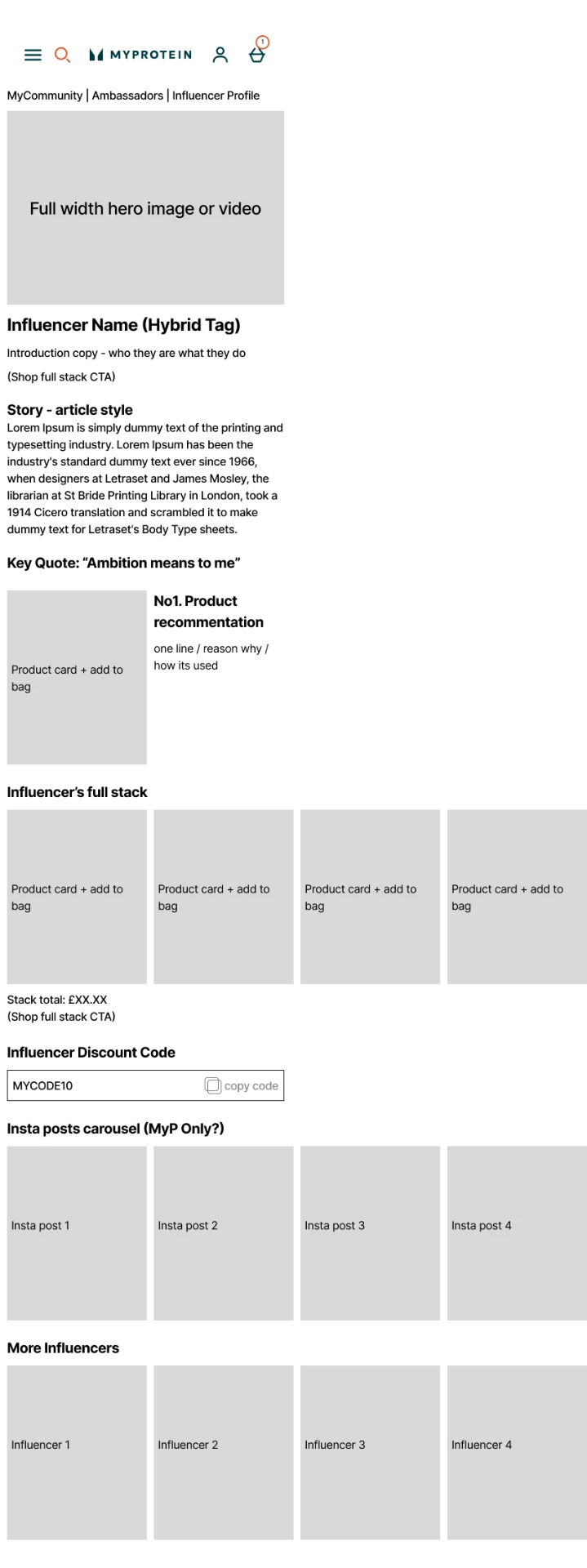
Version 2: first restructure

Version 3: second restructure

How the page layout changed across three versions.
Outcome I can share
The page is live, and testing directly changed its structure. I'm not able to share results.
What I took from it
What surprised me most was how much cross-collaboration it took to bring a page like this to life: the influencer team, UX research, trading and engineering all shaped it. If I ran it again, I'd work directly with the ambassadors, which I couldn't this time, so their pages felt more personal rather than being built from information in a spreadsheet. And I learned that constant communication, including transparency, which means sharing before you're asked, is one of the most important parts of any group work.