Product UX · Mobile
App Store screens
I redesigned MyProtein's App Store screenshots so they match the live app, and localised them for iPhone and iPad.
- Role
- UX Designer
- Year
- 2026
- Platform
- iOS App Store (iPhone and iPad)
- Tools
- Figma, Claude
My work at MyProtein is internal, so I'm not cleared to share figures or results. This case study focuses on the problem, my process, and the decisions I made and why.
The problem
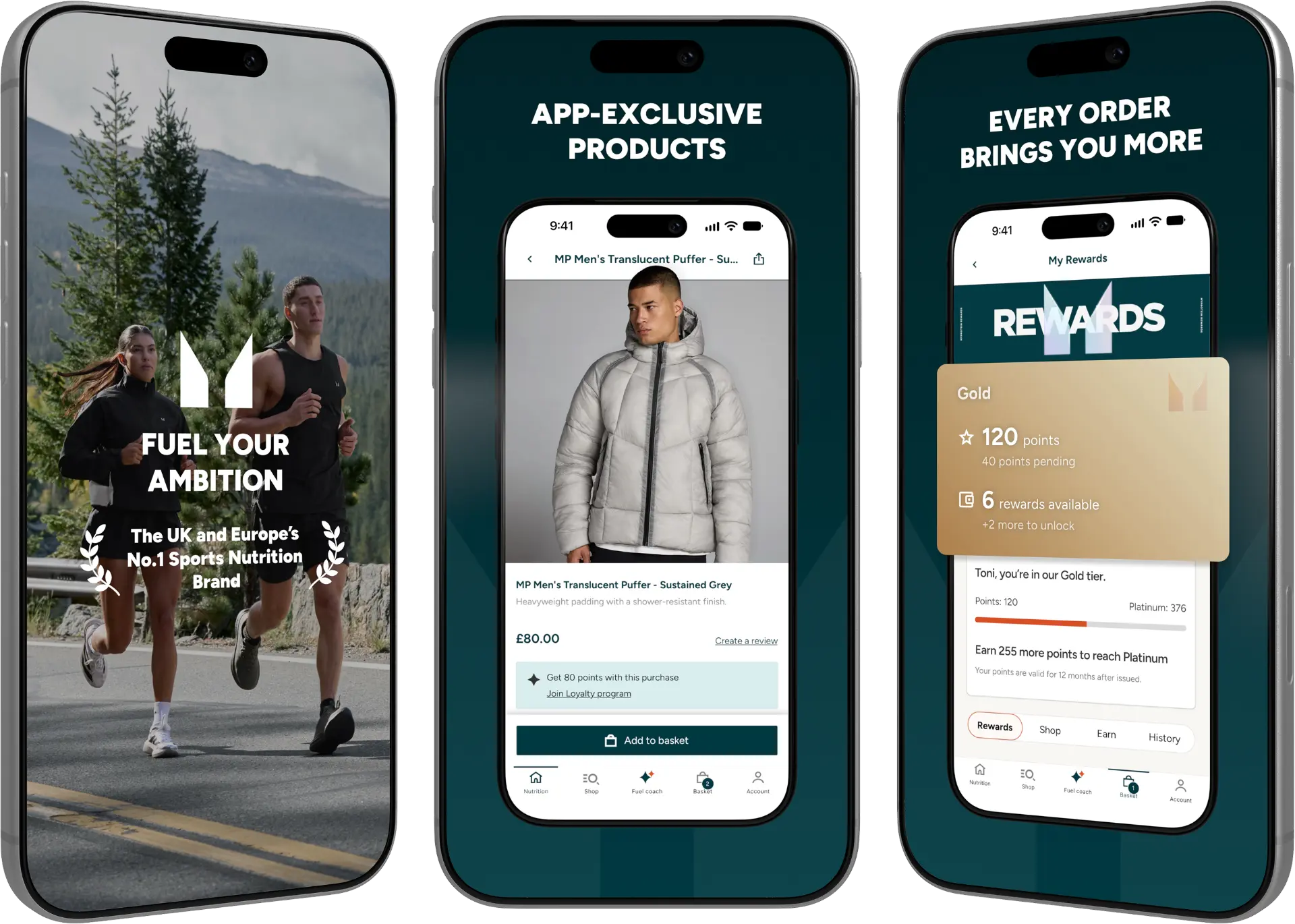
The App Store screenshots were well out of date and no longer matched what the app showed live, and Apple declined them. The listing needed a fresh set, and I was given the freedom to make something fun.
My role
I owned the design for iPhone and iPad, working with brand, content, localisation and engineering colleagues.
Before and after
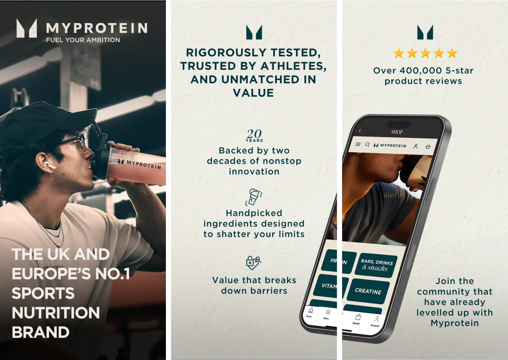
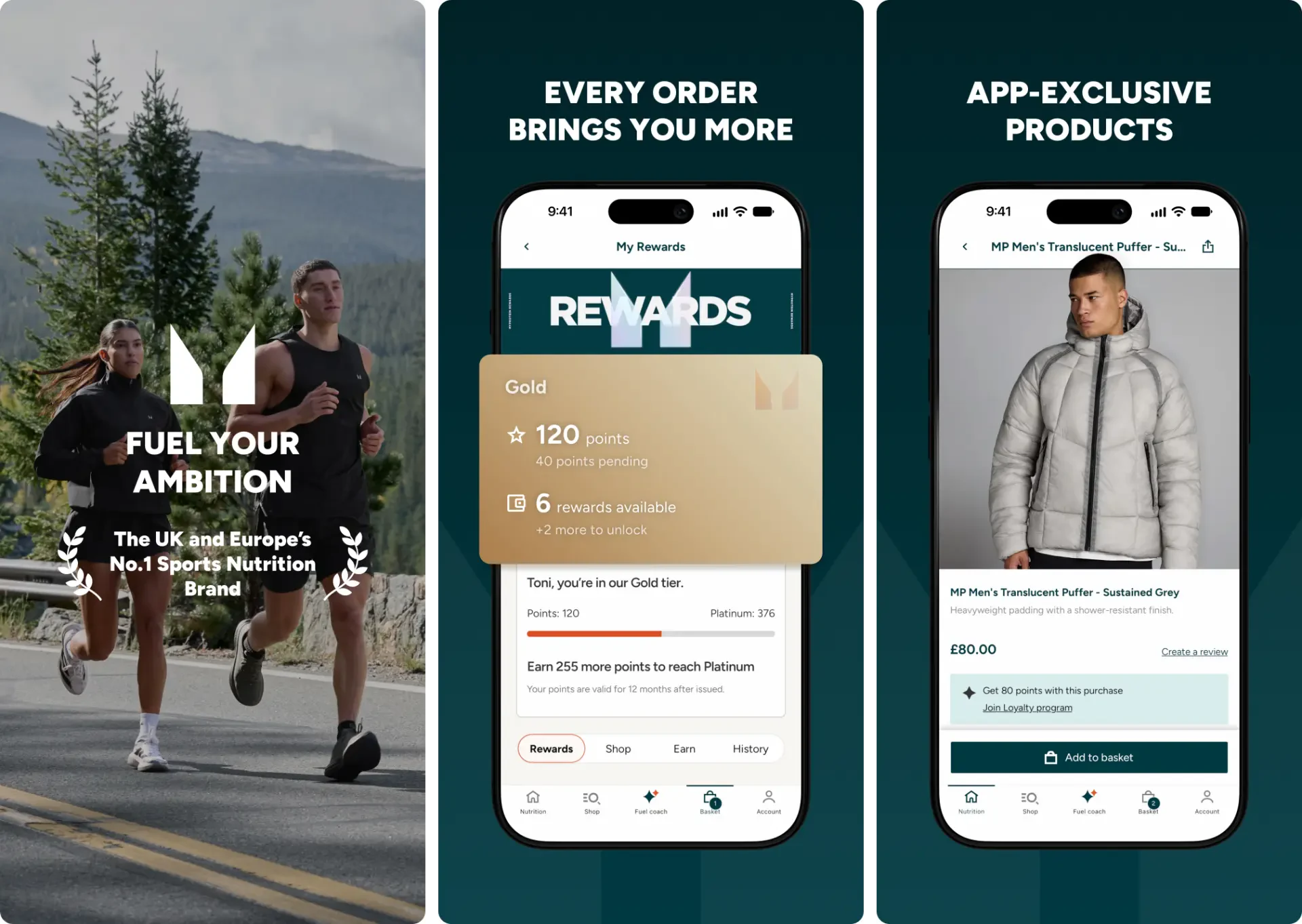
Key decisions
- Kept what already worked, shortened every headline to a few words and removed the clutter, so each screen makes one point.
- Opened with a full-bleed photo and brand line, then followed with real app screens inside device frames. Only the first three screens show in store search, so they carry the brand, the products and rewards.
- Used the app's real screens with matching status bars, so what shoppers see in the store is what they get.
- Chose Figtree, an open-source typeface, so every asset is cleared for commercial use, and free Noto Sans fonts for Greek, Korean, Arabic and other non-Latin scripts.
- Localised the set into 20+ languages for iPhone and iPad. I kept 'AI Fuel Coach' as a product name instead of translating it, set Arabic right to left, and checked every headline still fit. I built the localised sets with Claude and Figma from the translation sheet.
The screens
Outcome I can share
All six screens are live on the App Store and match what the app shows. I'm not able to share results.
What I took from it
The hardest part was the tight deadline, which meant a few late nights staying behind to help the team, but passion makes that easy. I learned that designs have to scale across languages and screen sizes, just like any web or app experience. And I learned that I'm more than capable of designing beyond web, app and interactive work: my UX skills transfer completely to more brand-focused design.